Composable Elements
Now it's time to go over every composable elements.
Special Composable Methods
Before we look at different composable elements, here are some useful methods in them:
Composable#bind
Binds a reactive state to this component, so whenever the state changes its value, the composable is marked dirty and will be re-rendered next tick.
Composable#into
Sets reactive state value to this component. Similar to React ref prop.
ReactiveState<Selection> myState = useState(null);
Selection mySelection = // ...
mySelection.into(myState);
assert myState.getOrNull() != null;
Composable#configure
Allows to configure a composable, e.g. subscribing handlers to certain states.
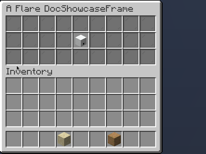
FunctionComposable
Normally, it is not recommended to extend the raw Composable interface
if you want to implement your own composable logic. Instead, you should extend the
FunctionComposable abstract class.
Here's an example:
public class DocFC extends FunctionComposable<DocFC.Props> {

    public DocFC(Props props) {
        super(props);
    }

    @Override
    public @NotNull Composable compose() {
        return Placeholder.of(Items
                .builder(Material.GOLD_INGOT)
                .name(props.name)
                .lore(props.lore)
        );
    }

    public record Props(String name, String lore) { }
}
Info
You can also override the click, rightClick, etc. methods to handle click logic, just like Frames.
Additionally, you can override destroy (for logic that is called when frame with composable is closed)
and restore (for logic that is called when frame with composable is restored, e.g. when pagination happens)
The result:
Placeholder
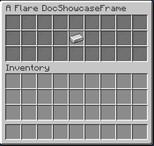
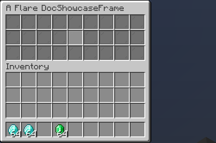
A placeholder is a non-interactable slot. Not much about it.
Button
Button is a clickable element. You can create button with a builder or normally.
// No builder
Button.of(
    ItemProvider.still(Items.withName(Material.DIAMOND, "Button!")),
    (btn, e) -> true // (1)!
);
// Builder (recommended, more configuration)
        Button
                .builder(ItemProvider.still(Items.withName(Material.DIAMOND, "Button!")))
                .onClickCancelling((btn, e) -> { /* (2)! */ })
                .onLeftClick((btn, e) -> true)
                .disabled(false)
                .inside(Slot.ROW_ONE_SLOT_ONE);
- Return true to cancel event, return false for event to continue
- Methods that end with
cancellingwill automatically cancel events, so you don't have to return a boolean
Checkbox
Checkbox is a button that can be toggled on and off. Can be built with builder or without
- Optional, if null, default value will be used
Result:
You can also optionally set name and description of a checkbox
Selection
A selection provides a choice between multiple values. You can scroll through a selection using both right (backward) and left (forward) click.
Selection
    .builder(
        List.of("Value 1", "Value 2", "Value 3", "Value 4")
    )
    .selected(3) // (1)!
    .formatter(str -> str) // (2)!
    .inside(Slot.ROW_TWO_SLOT_FIVE);
- Sets current selected index to 3
- Adds a formatter for values. Useful if you have an Enum inside the selection. NOTE: either an explicit ItemProvider should be set through
item, or a formatter throughformatter, otherwise the composable will not work.
Result:
Slideshow
Slideshow is a periodically changing Placeholder.
Slideshow
    .of(List.of(
        Items.builder(Material.GOLD_INGOT),
        Items.builder(Material.DIAMOND),
        Items.builder(Material.EMERALD),
        Items.builder(Material.IRON_INGOT)
    ), 10 /* (1)! */)
    .inside(Slot.ROW_TWO_SLOT_FIVE);
- Period of item changing, in ticks. 10 ticks is equal to half a second.
Result:
GoBackButton
A GoBackButton returns you to previously visited frame. It will only render if there was a previous frame.
Result:
TextInput
A TextInput allows user to input text, and may additionally validate it.
TextInput
    .builder()
    .validate(Validator.matching("[a-z_\\d]*"))
    .build()
    .configure(input -> input.onTextChange(newText -> getViewer().sendRichMessage(newText)))
    .inside(Slot.ROW_TWO_SLOT_FIVE);
Result:
You can also use some commonly used builtin validators via the Validators utility class.
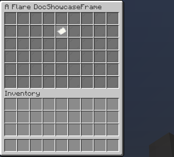
ProgressBar
A progress bar allows you to display certain progress, based on a ReactiveState.
var state = useState(0f);
FlareUtil.executeNTimesAsync(() -> state.set(state.get() + .05f), 20, 10);
this.compose(
    ProgressBar.of(
        ProgressBar.fullProvider(state, Material.GREEN_STAINED_GLASS_PANE, false),
        ProgressBar.emptyProvider(state, Material.YELLOW_STAINED_GLASS_PANE, true)
        /* (1)! */
    )
    .configure(bar -> bar.progressState().connect(state)) // (2)!
    .bind(state)
    .inside(Slot.ROW_TWO)
);
- The last boolean is the
dottedparameter. It changes the way progress is displayed inside item lore. - Makes it so that whenever
statechanges, new value is propagated to bar's progress state
Warning
It is important that the progress state should be within 0 and 1. Otherwise, errors may arise.
Result:
ContainerSlot
A container slot is a slot that can store and accept items inside it.
ContainerSlot
    .builder()
    .filterPut((item, e) -> item.getType() == Material.DIAMOND)
    .onPut((item, e) -> e.getWhoClicked().sendPlainMessage("Put diamond!"))
    .onTake((item, e) -> e.getWhoClicked().sendPlainMessage("Took diamond!"))
    .inside(Slot.ROW_TWO_SLOT_FIVE);
Result:
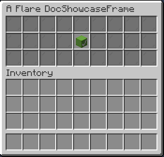
Composition
A composition by itself does not render anything, it can contain different composable elements in itself. All elements are assigned with relative slot space. For example, if you create a composition like this:
Button button = ...;
Placeholder placeholder = ...;
Composition.of(
    button.inside(Slot.ROW_ONE_SLOT_ONE),
    placeholder.inside(Slot.ROW_TWO_SLOT_TWO)
);
When it is then rendered inside Rect from Slot.ROW_TWO_SLOT_THREE to Slot.ROW_THREE_SLOT_FOUR, it will be displayed
this way:
Compositions are useful for housing multiple elements within a single FunctionComposable.
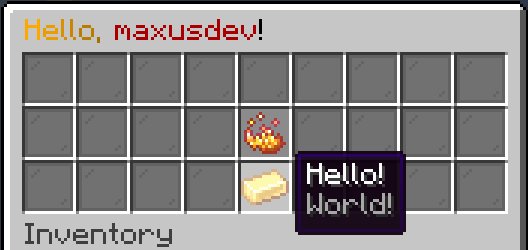
Modal
A modal is a button that can open temporary window. Here's an example to create a yes/no dialog modal using builtin configurator
Modals.YesNoModal.builder()
    .name("Yes/No Modal")
    .onAccept(() -> getViewer().sendMessage(FlareUtil.text("<gold>Accepted!")))
    .onDecline(() -> getViewer().sendMessage(FlareUtil.text("<gold>Declined!")))
    .declineName("Decline This")
    .acceptName("Accept This")
    .extraInformation("Click button to the right to accept, or click the button on the left to decline.")
    .description("Try testing yes/no stuff")
    .build()
    .inside(Slot.ROW_TWO_SLOT_FIVE)
Warning
Modals currently may not work properly with frames of the same size (3 by 9).
Result: