UI Basics
In this page we will go over basic UI creation with Flare. Check out the Flare Basics first if you haven't already!
Composable
A Composable is an interface that represents an element that can be rendered
inside inventory in Flare. More on different composable types in the UI Elements section.
Initially composable elements don't store any data on where they should be rendered.
For that there is another interface (that you can implement): ComposableSpace, which shows
where a composable should be rendered. By default, Flare provides three implementations of
composable spaces:
Slot
A single slot stores row and column positions inside Inventory. There are also static utility fields that can help you get a specific slot:
Slot.ROW_ONE_SLOT_TWO; // equal to new Slot(0, 1);
Slot.ROW_FIVE_SLOT_ONE; // equal to new Slot(4, 0);
Slot.ROW_THREE; // space containing all slots inside row one
Slot.ALL; // space containing all slots inside inventory
// Slot.COLUMN_N is currently planned
Rows are enumerated starting with 0 and going up to 5 for the row 6 of a six-by-nine inventory. Columns are enumerated from left to right starting with 0 and going up to 8 for column 9.
Rect
A Rect is a rectangle area containing all slots starting with Slot A, and ending with Slot B inclusive.
Here is an example:
Rect.of(Slot.ROW_ONE_SLOT_ONE, Slot.ROW_THREE_SLOT_TWO);
/*
    will construct a rectangle between slots (0, 0) and (2, 1)
    when represented in inventory will look like this:
    $$#######
    $$####### -> @ are slots occupied by rect, # are the ones that are not
    $$####### (if the inventory dimensions are THREE_BY_NINE, more on that later)
*/
SetSpace
A SetSpace defines a set of slots it occupies. The slots are static and immutable. You should use SetSpace if you want to define non-conventional slot space, e.g. a diagonal space.
var space = new SetSpace(Set.of(
        Slot.ROW_ONE_SLOT_ONE,
        Slot.ROW_FIVE_SLOT_THREE,
        Slot.ROW_SIX_SLOT_FOUR,
        Slot.ROW_SIX_SLOT_FIVE
        ));
Frames
In Flare, a single UI is represented by a Frame. There are different kinds of
frames, we will go over all of them.
What all frames ultimately do is store Composable elements inside them. Here's how to make a simple frame:
And then to open it to a player:
Here's what you get with this simple code:
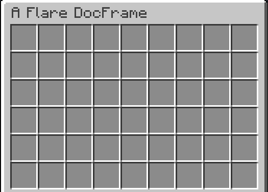
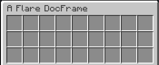
As you can see, default UI size is 6 by 9, if you wish to change this, you can override the constructor:
public class DocFrame extends SimpleFrame {
    public DocFrame() {
        super(Dimensions.THREE_BY_NINE);
    }

    @Override
    public void init() {

    }
}
Handling Clicks
You can override the onClick, onRightClick, onLeftClick, etc. to handle extra click logic for your frame.
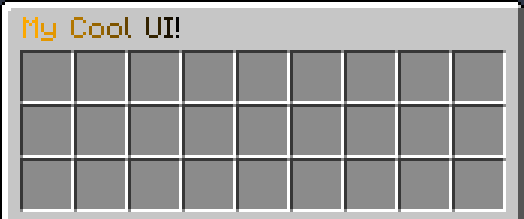
Composing UI
Now it's time to change our actual initialization logic. Let's change our UI title!
- All strings in Flare support lenient MiniMessage for component styling. Read more about MiniMessage here
And here's what you get:
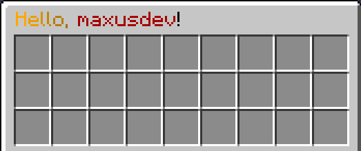
PlaceholderAPI is supported (if it is enabled and the plugin is present)!
@Override
public String getTitle() {
    return "<gradient:gold:black>Hello, <dark_red>%player_name%</dark_red>!";
}
Alright, now that we have set up the frame, let's start actually adding content to it!
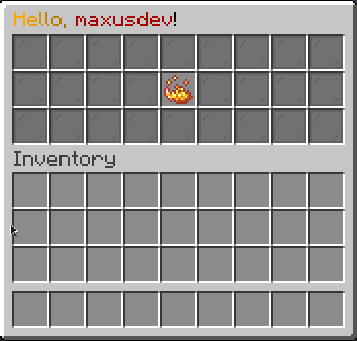
Let's add some background and a button!
@Override
public void init() {
    this.compose(
        Placeholder
            .of(ItemProvider.still(Items.empty()))
            .inside(Slot.ALL)
    );
    this.compose(
        Button
            .builder(Items.builder(Material.BLAZE_POWDER)
                            .name("<gold>I am a button!")
                            .lore("<yellow>Click me!")
                            .hideAllFlags()
                            .glint())
            .onClickCancelling((btn, e) ->
                e.getWhoClicked().sendMessage(FlareUtil.text("Hey, you <gold>clicked</gold> me!"))
            )
            .inside(Slot.ROW_TWO_SLOT_FIVE)
    );
}
This should create a simple Frame with a background and a button. Here's the result:
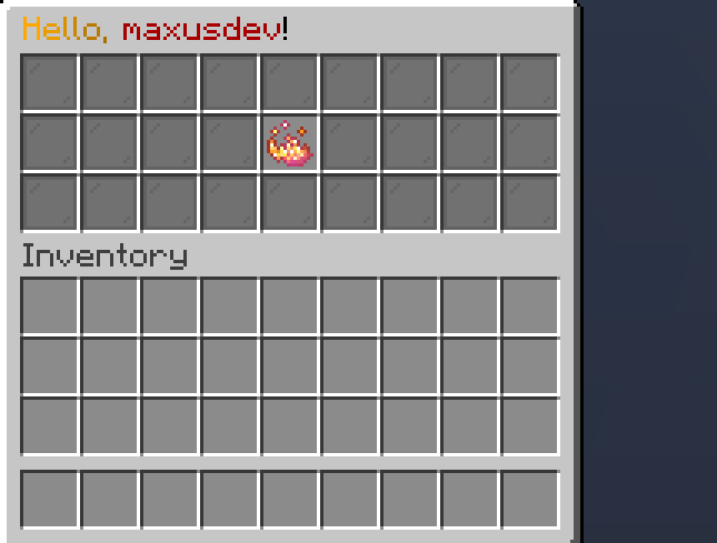
Some Reactivity
Let's add some reactivity to this UI! All frames have a utility hook called useState,
which allows us to define a reactive state faster. We can then use a ReactiveItemProvider to
re-render our button on state change:
@Override
public void init() {
    // Replace the button composition with this:
    var clickCount = useState(0);
    this.compose(
            Button
                    .builder(Reactive.item(clickCount, newCount ->
                        Items.builder(Material.BLAZE_POWDER)
                                .name("<gold>I am a button!")
                                .lore("<yellow>You clicked me <green>%s</green> times!".formatted(newCount))
                                .hideAllFlags()
                                .glint()
                                .build()
                    ))
                    .onClickCancelling((btn, e) ->
                            clickCount.set(clickCount.get() + 1)
                    )
                    .build().bind(clickCount) // (1)
                    .inside(Slot.ROW_TWO_SLOT_FIVE)
    );
}
- When we bind a ReactiveState to a Composable, the Composable is marked dirty and re-rendered on state change.
Here is the result:
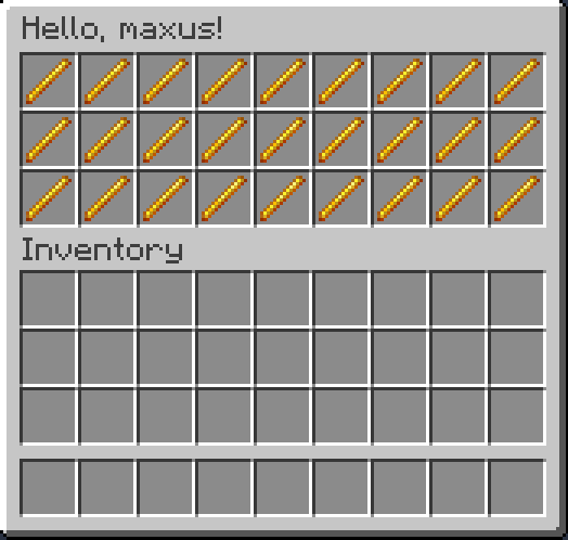
Frames with arguments
You can't just pass arguments to normal Frames.
You should extend a ParamFrame instead.
public class ParamDocFrame extends ParamFrame<ParamDocFrame.MyProps> {

    protected ParamDocFrame(@NotNull MyProps params) {
        super(params, Dimensions.THREE_BY_NINE);
    }

    @Override
    public String getTitle() {
        return "Hello, %s!".formatted(props.name);
    }

    @Override
    public void init() {
        this.compose(
                Placeholder
                        .of(
                                Items.builder(Material.BLAZE_ROD)
                                        .name("<gold>%s".formatted(props.message))
                        )
                        .inside(Slot.ALL)
        );
    }

    public record MyProps(String name, String message) { }
}
You can then open it this way:
Flare.open(new ParamDocFrame(new ParamDocFrame.MyProps("maxus", "This is a frame!")), (Player) sender);
Which produces:
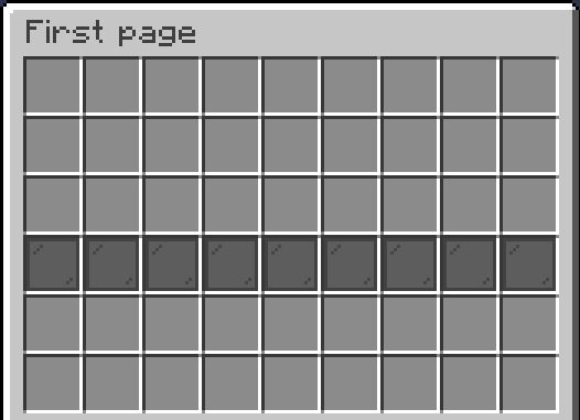
Pagination
You can add different pages to frames too! Check this out:
public class DocPagedFrame extends PaginatedFrame {
    @Override
    public void init() {
        createPage("First page", page /* (1)! */ -> {
            page.compose(Placeholder
                    .of(Items.empty(Material.BLACK_STAINED_GLASS_PANE))
                    .inside(Slot.ALL)
            );
        });
        createPage("Second page", page -> {
            page.compose(Placeholder
                    .of(Items.empty(Material.GREEN_STAINED_GLASS_PANE))
                    .inside(Slot.ALL)
            );
        });
        createPage("Third page", page -> {
            page.compose(Placeholder
                    .of(Items.empty(Material.YELLOW_STAINED_GLASS_PANE))
                    .inside(Slot.ALL)
            );
        });
    }
}
- The page parameter here works exactly as a Frame instance. You can compose, add listeners, and use hooks just like with normal frame instances.
And here's the result:
If you wish to pass extra props to a paginated frame, you should extend ParamPaginatedFrame instead of
PaginatedFrame.
But how do we change pages? The answer is simple: use pagination display or tabulation!
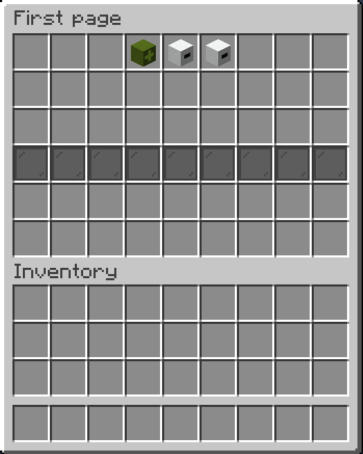
Tabulation:
Add this at the top of init:
- You can define your own space as well
And here's the result:
Warning
The useTabulation (and usePaginationDisplay) hooks are composed at the very bottom of the
Composable tree. So, if you, for example, decide to add a component that goes over them, it will overwrite
tabulation. In these cases I recommend using pagination#composeShared before composing any pages. It will ensure that
composable (e.g. background) is rendered inside all pages.
Pagination Display
You can also use a PaginationDisplay if you want:
Result:
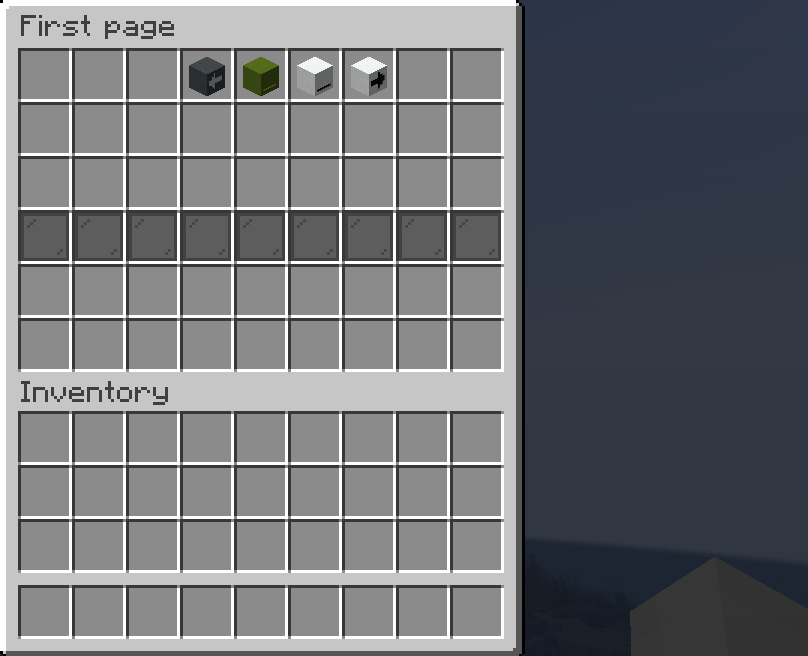
PaginationDisplay is dynamic, so you can choose as much space as you want (minimum 3), and it will render fine.